
When you watch a movie, you might not consciously notice the film composition rules at work. But good cinematography uses them to create shots. They stay in your mind long after the scene is over. One big part of cinematography is composition how you place people, objects, light and space inside each frame. A well composed shot tells a story, leads the eye and conveys emotion.
There are many “rules” or guiding principles to help with composition. These are not hard laws you must follow always, but they are useful tools. Also, many great films sometimes break these rules for effect.
What Are Film Composition Rules? Top 5 Rules with Examples
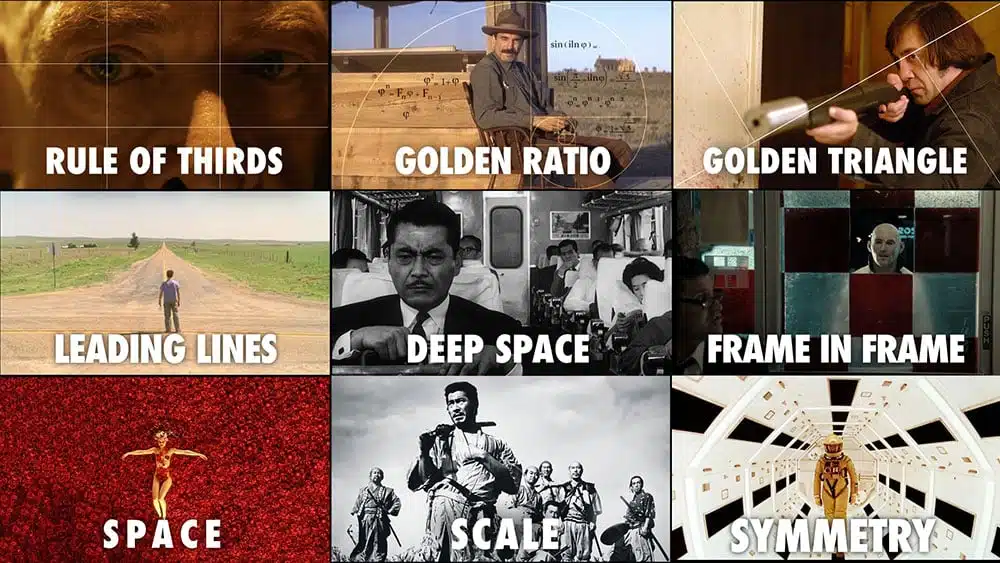
Film composition is the art of placing subjects, objects and spaces in a way that tells a story visually. Great directors and cinematographers use simple rules to make their shots more powerful, emotional and interesting. These film composition rules help filmmakers decide where to place the camera, how to frame a subject, and how to guide the viewer’s eyes through a scene, while a beat sheet helps them plan these visual choices around key story moments and emotional beats. They are not strict laws but useful tools to create balance, emotion, focus and meaning in each shot.
Rule 1: Rule of Thirds
Imagine dividing your frame into nine equal parts by drawing two horizontal lines and two vertical lines like a tic tac toe grid. In film composition rules, the rule of thirds suggests you place important points or figures like eyes, faces and objects along those lines or at their intersections rather than dead center. This gives visual balance, draws the eye and makes the frame more dynamic.
The rule of thirds works because it stops the picture from feeling boring by not always putting the subject in the center. It also gives space around the subject called negative space, which helps make the subject stand out more. Plus, it helps guide the viewer’s eyes naturally to the most important part of the scene.
Example: Dune (2021)
In Dune, director Denis Villeneuve often uses the rule of thirds to emphasize the scale and hierarchy in a action scene. In one shot, the emperor’s messenger enters in the top third of the frame, while below him is a large expanse of architecture and ground. The viewer’s eye is drawn to that top third first. The carpet and architecture also act as leading lines to guide you.
By not placing the figure in the center, the shot feels more grand and gives a sense of space and weight around the character.
Sometimes filmmakers break the rule and put the subject right in the center to show things like balance, tension or feeling off. For example, Wes Anderson often centers his characters to create a unique, stylish look. Breaking the rule can be very effective, but it should be done on purpose.
Rule 2: Leading Lines
Leading lines are lines in your scene like roads, walls, beams, trees, architecture and shadows that lead the viewer’s eye toward your subject or a point of interest. You use natural or constructed lines in your environment as visual “guides.”
This rule works because it helps the viewer’s eye move smoothly through the picture. It adds a sense of depth and shows direction, making the scene feel more real. It also links different parts of the image together, helping to tell a story within the frame.
Example: The Lord of the Rings: The Fellowship of the Ring
In many scenes, the paths, roads and rows of trees lead your eyes toward the fellowship. In one shot in Rivendell, the walkway and columns recede into the distance, drawing your vision toward the character or focal point. That use of receding lines gives depth and focus.
Also, in Dune, the long carpet or hallways act as strong leading lines pointing toward the central figure, reinforcing importance.
When placing your subject, try to align them where leading lines converge or let the lines guide into or past them. But watch out if lines cross in odd ways, they can distract or confuse instead of guiding.
Rule 3: Framing and Foreground or Background Layers
This film composition rule is about how you layer your shot in depth like foreground, middle ground and background. Also about using “frame within a frame” like doorways, windows, arches or branches that act as natural frames around your subject.
This rule works because it adds real depth to your shot, making it feel three dimensional instead of flat. It also shows what’s around your subject, giving more context to the scene. Using a frame within a frame helps focus attention on the subject and can create a feeling of tension or isolation.
Example: The Grand Budapest Hotel
Wes Anderson’s style often uses “frame within a frame” for example, characters seen through doorways, windows or hallway arches. In The Grand Budapest Hotel, many shots place the character in the center of a window or arch, surrounded by decorative edges. This helps focus your eyes and adds a decorative, layered look.
Another example: Inception has many shots where objects or architectural lines in the foreground blur or frame the subject in the midground or background, giving a sense of depth and layering.
Sometimes a blurred object in the foreground can create a sense of distance or separation. In thriller or mystery scenes, foreground frames can add tension or hide parts of the scene from the viewer, making them wonder what is unseen.
Rule 4: Headroom, Lead Room, Lookroom and Negative Space
- Headroom is the space between the top of a person’s head and the top edge of the frame.
- Lead room or lookroom is the space in front of where a person is looking or moving. For example, if someone is looking or walking to the right, you leave space on the right so they have “room” to move or look into.
- Negative space is the empty or less busy area around the subject. It helps make the subject stand out and can also create feelings like loneliness or isolation.
This film composition rules works because if there is too much or too little headroom, the shot can look awkward. If there is not enough lead room, the actor can seem cramped or trapped, but too much lead room can make them look lost in the frame. Negative space sets the mood like showing a small person in a big empty space to make them feel lonely or overwhelmed.
Example: The King’s Speech
In The King’s Speech, many closeups of King George VI place his eyes near the top third, with ample negative space in front of him especially when he is struggling to speak or feeling burdened. The empty space in the direction he is facing emphasizes his inner conflict and hesitation.
Another classic: Vertigo uses very precise headroom to evoke unease sometimes giving too much or too little space to make characters feel unstable or off balance.
When framing moving subjects, keep your lead room consistent if your subject moves, readjust so they don’t “hit” the edge of the frame. Also, don’t always fill space sometimes the emptiness talks.
Rule 5: Symmetry, Balance and Visual Weight
Balance is about distributing visual weight bright vs dark, big vs small, color vs muted so one side of the frame doesn’t feel heavier than the other. Symmetry is a special case having both sides mirror each other or are nearly equal.
This works because a balanced frame feels stable and pleasing to look at. Symmetry makes the shot look very intentional and can even feel hypnotic or stylized. On the other hand, an unbalanced or uneven frame can create tension, make the viewer feel uneasy or draw attention to a certain part of the image.
Example: The Shining
Stanley Kubrick’s The Shining famously uses very precise symmetry. Many interior shots center hallways, doors and characters so each side mirrors the other. This balanced, symmetrical composition gives a feeling of order but also unease because you sense something off underneath.
Another: Blade Runner 2049. Some shots of futuristic architecture use symmetry to show order, control and the cold world. Then breaking the symmetry signals disorder, change or character conflict.
Even if a scene is not perfectly symmetrical, you can still make it feel balanced by using visual weight. For example, a large dark shape on one side of the frame can be balanced by several smaller shapes or bright colors on the other side. This helps keep the image interesting without feeling off balance.
Why Filmmakers Break Composition Rules?
Great filmmakers understand that composition rules are meant to guide, not restrict. Sometimes, breaking a rule on purpose can make a scene more powerful, emotional or unsettling.
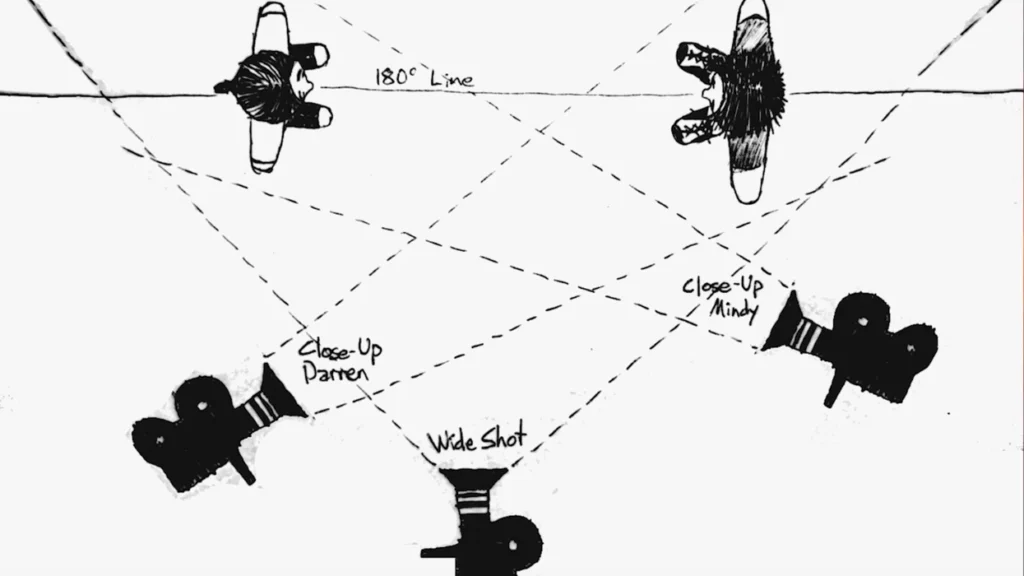
For example, breaking the 180° rule in a conversation can confuse the viewer and create tension as seen in The Shining’s famous bathroom scene. Placing a character in the center of the frame can make them feel isolated or off balance, which works well in some horror or dramatic scenes.
Using extreme negative space can highlight a character’s loneliness or smallness in the world. And breaking symmetry halfway through a film can signal that something has changed. The most important thing is to break the rules with purpose. If there is no reason behind it, the shot might just feel awkward or poorly made.
Why Film Composition Matters in Film?
Good film composition is like silent language. You may not consciously “read” every detail, but your eye feels the difference. When these five rules are used with intent, each shot becomes stronger, more directed and emotionally richer.
As a cinematographer or a filmmaker, learning these rules is essential. But more importantly, practice constantly. Watch films, pause and study frames, try shooting your own scenes using these ideas. Over time, you will develop an eye to know when to follow the rule and when to break it, beautifully.